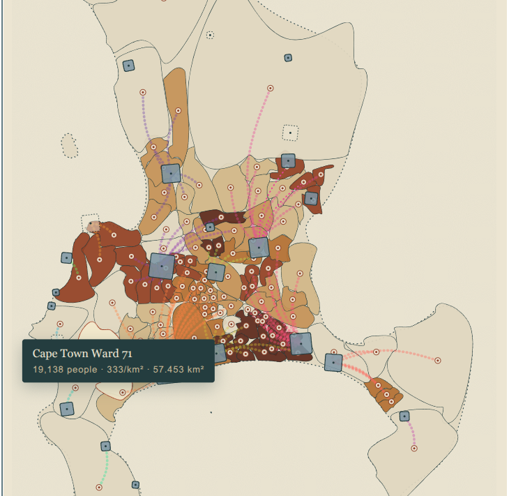
As part of thinking through the AquaSavvy tool visualisations, I revisited an idea from a loooong time ago (2018) that was part of the inspiration for AquaSavvy.
As an exercise, I’m not sure how this would make it into the AquaSavvy tool as is. I had to do a lot of wrangling with Claude, that I don’t think a layperson could or would want to do. It’s fine for the project to do this for our selected sites, but as a global tool meeting people where they are, I don’t know.
I wanted to visualise sanitation flows, TL;DR because people happily shit away and don’t understand that their shit has to go somewhere (same goes for waste, obvs). As long as it’s someone else’s problem, who cares.
I wanted people to care about the treatment works and help make them run better, rather than just get angry when the receiving water bodies are so polluted they can’t swim there. I wanted people to see that yes, government needs to do their job, but the challenges we are facing are so big and complex, that we need to work together in new ways to thrive.
The main win from this exercise was the “sculpted not surveyed” approach.
When I asked Claude to build this as a WordPress HTML snippet it pushed back at the resolution of the wards. “The real problem for a WordPress block: this geojson file is 3.4MB with ~41,700 coordinate points, at 7-decimal precision (millimeter-level — you don’t need that for a ward map). Shipping that raw would tank page load. Let me simplify it properly before we touch any D3 code. … That’s a strong result: 3.4MB → 208KB for the 116 wards (94% smaller)” (TODO: figure out how we do this for the tool as a whole).
Now, when I speak to GIS professionals, this “heavy data” is also flagged as a problem, and then the conversation ends there. It’s just a matter of “the data is too heavy to incorporate into games” and that’s it. Not so with Claude. Claude happily downscaled into abstraction (I mean, I pushed it until I just got blobs, then had to rewind a bit, lol), and that’s what I needed!
There’s a lot to be said here for the complementarity of human intelligence with AI, because AI doesn’t have those professional worldview blockers that is stopping the physical world making it into games in the way I want it to. I’m sure there are people out there who would understand what I’m trying to do, but I haven’t found them yet. So while I find them, I need to be able to SHOW what I’m trying to do, and Claude is great for that.
My old attempts:
- https://observablehq.com/@indiebio/wwtw-dots-on-a-map
- https://observablehq.com/@indiebio/try-2-mapping-sewage-flows-in-cape-town
- https://observablehq.com/@indiebio/try-3-getting-both-the-ward-centroid-dots-and-the-wwtw-dots-on
My starting brief: I want to map sewage flows from households to treatment plants and on to receiving waterbodies. As a reminder, my work is concerned with improving citizen participation: I am less concerned about the level of accuracy, and more concerned about human-centric approaches. This means I am not even concerned about photorealism, and I like the approach of rendering with curves instead of straight edges.
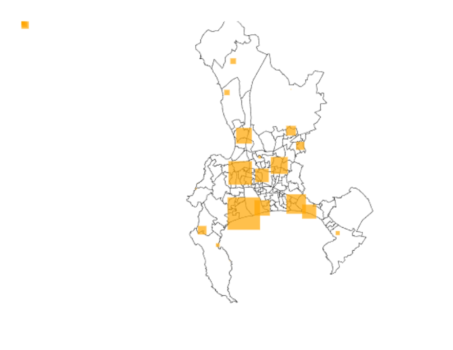
Now I’ve been stuck with this for 8 years, and Claude managed to wrangle this in a few hours. Totes amazing. Of course then it all got so complicated and messy. I liked the original elegance of the outline map with it’s yellow squares. I guess I didn’t really think through how adding more and more information would make it so messy. So I’m currently stuck there a bit, but as for a prototype idea for AquaSavvy, it’s something to discuss.
Next would be to show the outflows from the wastewater treatment plants, and then I guess make those outflows meaningful: calculate the nutrient loads (along with the chemicals of emergent concern – the drug metabolites etc) and show that as a pollution map or something.
Code below, as an embedded snippet, a html file you can download, and a screenshot in case something broke or got blocked.