

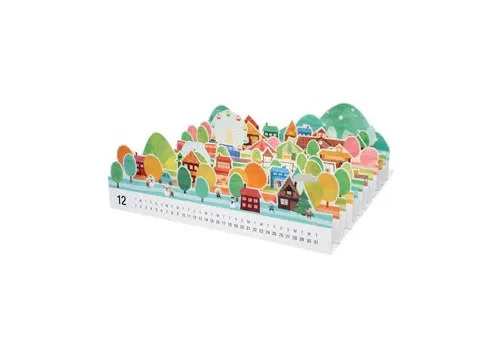
Inspired by Fil’s Layers Perspective, as well as this papercraft calendar. The idea is to be able to isolate some elements, and then see how they relate.
For some reason, rather than how Fil’s map worked, layering roads, buildings, rivers, whatever, I went down the house -> street -> neighbourhood -> city … watershed -> global map route. This meant the layers didn’t really work, it was more a weird zoom idea.
The house→street→neighbourhood→city→ecology framing is literally a scale hierarchy, which maps cleanly onto “index in a stack.” Each rung is a layer; the perspective explode reveals the containment relationship (a house sits inside a street sits inside a watershed) the same way the map notebook reveals that a building layer sits inside a terrain layer. Claude noted from related conversations we’re doing artful/simplified geometry rather than survey-accurate maps, that the layers can be illustrated, the way the calendar’s papercraft is illustrated. This really freed things up.
It picked up on the Sankey conversation (an early idea, later one still needs the blog) – that because we’re already doing flow diagrams (the Cape Town sewage work, the rain Sankey), we could route an actual flow line through the stack — a path that starts at the house layer and threads down to the ecology layer, only becoming visible as the stack opens. That’s a nice way to literally draw “this resource flow connects a house to a bay.” I thought this was epic and I’m not sure I could have come up with this on my own, just another idea that would have been lost in my sea of ideas.
The actual visualisation of this particular example sucked, but the rough mechanism was coded (html file below if you want to look), and I went down a road looking at the street level view in particular. At this stage I was also still on the three.js, 3D visual look, but it warned me that doing 3D in many layers can get expensive – aka difficult to load. So for the street level I ended up going down a La Linea road… Maybe the city or ecology layer can be 3D, but actually I think 3D doesn’t have a place in here. The top 4 layers are mappy, and the bottom two are La Linea – next blogpost shows what I mean.
So, 6 layers in the stack:
6 – the global map, the global tool (public)
5 – the watershed
4 – the city
3 – the neighbourhood
2 – the street
1 – a cartoonish house to map your household flows.
A user can click on the global map, on a city, or watershed, or maybe select it from a list, especially early on when we don’t have many cities that are well formed. (I also don’t know how to link the city with the watershed, it’s not a straightforward zoom, there is overlap and divergence – the human boundaries and watershed boundaries are not the same). Then from the neighbourhood down, this is probably not all public data and becomes the domain of the community data portal (CDP). So here I think a user maybe needs to log in or create their own local copy. Data from any one layer can pull in data from other layers, so maybe a street is an averaged collection of values from the houses, and a neighbourhood takes in statistics data from the city to make some estimates about the neighbourhood population, I dunno.
And so the zoom isn’t linear either, it’s not like “the website” or “the tool” has “one house” goes to one street up to one neighbourhood to one city. Different users can go down the map to where they live, or up from their house, so nobody’s journey is exactly the same. And this isn’t all hosted on the internet. The CDPs are locally hosted, for example. Your house, your data, it’s private.
2 Replies to “Layered visualisation of resource flows”